So The introduction
Meeting the representatives of a company I understood a couple of facts about the company and some aspects they wish to be involved in to designed image.
- Friendly (They want to create friendly welcoming environment for guest of the three day long conference, which as any other conference is kind of boring.)
- Diverse (They want and accent to be put on diversity of people involved in to learning and members of conference and involved society in total)
- Ecology (They support recycling and greener world movement)
- Global (They mentioned that people from whole commonwealth maybe even more appear at conference so they are king of global)
As I understood we need to capture every lecture and write something about it so here are my notes and first ideas that came to the mind.
Diversity or second lecture reflection
Talking about diversity first that comes to my my mind are people from different backgrounds, social classes, religions, ethnicity so color etc but thanks to Leigh who indirectly explained why nowadays this kind of images are used seldom and how to avoid being criticized for discrimination or something like that. I tried to draw doodle character diverse version but later one I understood that its actually to detailed and can perfectly fit in to criticized category so in the world of Art where simplicity is the key I thought of different type of diversity. We all are made of meat shit and bones everything else are just details so key of my vision of diversity in this project will be common things not different, we all are people and that's the key.
A bit of nostalgy or a grandma of modern diversity. In every soviet schoolbook you was able to find similar images with slogan - friendship of the nations and drawings of children from worldwide holding hands. As a child I used to like to explore these illustrations and compare traditional outfits of different nations, how similar or completely different it was.
And here comes example of modern type of diversity illustration which honestly saying irritates me. I understand the point of non insultive way but hell, where did you see green/blue/purple skinned person?! I saw different people from pale skinned with blonde hair to very tanned and black haired so here is my spit on to design of crocodile faced student, if I will meet one in a real life I will definitely apologize for my words. Also I would like to highlight the simplicity of the design. Analysing brand logo development during HNC in Art and Design course I took last year, I noticed that design from complicated highly detailed medieval blazons it turned in highly contrasted primitive lines and shapes. Funny but someone who created this image below agrees with me.
Viva La Doodling
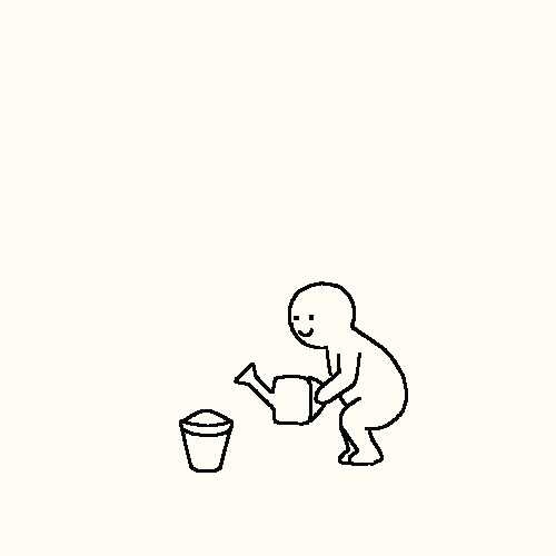
Seeing childish designs used by introduced company, first what came to my mind was doodling. Small creatures which can add a drop of fun in to conference + exploring company's website I noticed its design contains just 3 main colors which are Green White and Black. I never tried to draw in this style, found it to simple and wished to drown in to details of hyper realism but we need to learn something right? So i can force myself to try something new.#
Kerby Rosanes
Philippines-based illustrator Kerby Rosanes works mainly with ink, fineliners and markers to illustrate his “doodle” world. He considers his art as a personal hobby which became his part-time freelance work after being recognized by various design blogs, international magazines and online art communities.In 2014, Kerby left his job as a graphic designer from a local company to finally pursue his passion: creating more art for personal projects and for clients while collaborating with other artists, global brands and design agencies around the world.At 25, Kerby has already published five books including The New York Times best-seller, Animorphia in 2015, which is now available in 30 language editions in over 40 countries. The success of his books paved the way for him to travel the world while making art and attending events including live TV appearances on BBC World News and ABC’s Good Morning America in 2016.When not at work, he is either exploring another country or hunting down One Piece action figures.Drop him a line at contact@kerbyrosanes.com for inquiries.
https://kerbyrosanes.com/about
I met this guys work working as real estate agent in center of Riga city, office work never attracted me and was destroying for my impulsive active nature so not to die bored on the lunch break I popped into book store downstairs and found a coloring book for adults named "Animorphia", grabbed some set of coloring pencils and office work was never the same.
My first diversity try
Analysis
I think we all are grown up people here and we know how important analysis is especially self analysis. ( I did write much more about it but then suddenly internet connection get lost and nothing got saved so no more explaining)
So to understand company and its expectations better I have to do analysis of artwork used before for website/banners/commercials to understand approximately what to offer, so here we go...
I put this image on top because in my opinion it represents values and some aspects mentioned by company representatives.
Artwork?! Very easy digital drawing, easy because having decent experience in drawing I can count how long time approximately this kind of drawing can take (damned perfectionist in me)
No comments. And here is the last one and mostly used for the last year conference. What can I say and should I really?! Obviously company doesn't expect highly detailed art pieces with deepest universe meaning if they are fine with simplest digital designs but I hope they would appreciate a bit of hand work and small details.
Looking at stickers of ALT
From far it looks good, I do like it but take a close look. do you thing the same as I?
But I really like this "diversity" sticker someone invested a little bit of his precious time in to this work.
Text
Did someone said virtual reality?!
gf
ff