IDEA FACTORY
Last updated 21 October 2019, 15:22
SECONDARY RESEARCH
Renzo Piano's the Shard, on Tissue Paper
"I was quite attracted by the idea of… not really of making a tall building, but the idea of making a mixed-use tower – a vertical city."
"In some ways it is difficult to clarify between the conscious and the subconscious – between rationality and instinct"
This small piece of tissue paper is an interesting example of how a design develops through sketching. Renzo Piano sketched the initial drawings of the Shard on this piece of tissue paper, which eventually became the huge tower it is today. I love the confident strokes used to convey the shard-like shape of the building. Most importantly, I can see the idea evolving from a simple sketch of a shape,to something more detailed and complex, and finally, into the tower that it is today. Connections can be seen in the shapes and forms iterated through each sketch. I hope to include this kind of visual idea development in my current project, and further projects to come. In an interview touching upon the development of his idea, Renzo Piano mentions that his idea of the tapering nature of the structure was both a rational and instinctive decision- that there was both a functional and aesthetic need for the form. I want to achieve the same harmony in my designs, where I don't just find the balance between functionality and form, but instead allow form and function to complement each other- I believe that they are both integral to a good design.
Ettore Sottsass
This drawing's disregard of practicality is what interests me the most. Had this drawing started off keeping practicality in mind, it never would have turned out to be so interesting. I myself believe that such unconventional forms can only arise spontaneously, through continuous concious or unconcious thought over a period of time. Even if the final design can't be made- the idea still exists, without considering whether it is feasible or not. I feel that this is a form of creativity, and it is this creativity in thought that I want to incorporate into my designs. Not only will it add a stroke of my own individuality to my work, but also open my mind up to a universe of possibilities that I previously may not have even tried to imagine. As of now, I am not able to imagine as I wish to, but I will work towards doing so.
Many of Ettore Sottsass's sketches have a unique, science-fiction-ish style to them, which I infer from the colour scheme and unusual geometry in the forms. This is mirrored in the actual designs, which themselves have vibrant colours and embody the childlike playfulness that defines these designs. As a fan of science fiction, I love the futuristic quality of his work (I find that wonky shapes and bright colours, especially on a grey, moonlike surface, seem futuristic to me).
Anish Kapoor, La Torre Orbit London
There is so much experimentation in these sketches. Anish Kapoor experiments with shape, structure, and form in this series of developent sketches, but each sketch, though slightly different, is connected with the rest through the same underlying theme that is the winding, loopng shape of the structure. The development seen in these sketches tells me the journey of the design. At first, I see Anish Kapoor starting with two dimensional abstract form which he develops into something three dimensional and more complex, in the next few sketches. I love that the strokes are so confident, which comes from the single thick black pen used to sketch. The red pen used in the later stages shows that he is thinking about colour at this stage. It is intriguing that the final structure is like an extension of these development sketches, because of the same themes in form, colour and structure. It is so huge, yet it came from such small sketches on paper, which is wonderful. I want to incorporate this clear visual story of experimentation and development into my own design development process. I especially want to draw from this work by always having a clear connection between my sketch development and 3D models, and especially between them and my final piece.
Christo: Proposal for Wrapped Building
Christo: Proposal for Wrapped Trees
The sheer absurdity of this idea is what makes it so appealing. Wrapping trees and buildings is such an out-of-the-world idea, the likes of which I would never be able to imagine or think of. Christo's works usually involve very large-scale projects that have beautiful aesthetic value. More than that, they induce wonder. I would like to introduce such extraordinary thinking to my work, and create ideas that push boundaries, and break the norms. To do so, I need to look at many more works, so that I understand what the norms are and how far I can push them.
Barbara Hepworth: Collage for visualisation
Collage technique for displaying work within context
Rachel Whiteread: Proposal for Untitled (Stairs) 2001
Using tracing paper/ drawing over pictures to emphasize/add features or details
PRIMARY RESEARCH
I went to Finsbury Park to focus on the context of the forest home. I aimed to establish a clear picture for its setting and mood. The sheer size of the trees all around was inspiring- they make one feel small and insignificant, and yet an integral part of nature. This feeling is the perfect escape from the negative consequences of utilitarianism, which especially includes the disregard of individual hapiness. I feel that the woods, therefore, can be explored in different ways: the material, and the life all around us. This also gives me a drive to design a sustainable home to blend in to and grow with nature all around. Therefore, I will research into sustainable materials to use in this project.
Wood: Living
Wood: The Material
The mechanism of my Collapsible Home was inspired by pop-up cards. I felt that such a simple folding mechanism would be perfect in making a sustainable home, because not only would it save extra space and materials (if other folding mechanisms were made), but also allow the home to be so light that it would be portable.
BIBLIOGRAPHY
ILLUMINATE
Last updated 22 October 2019, 1:57
PRIMARY RESEARCH
I hoped to be able to introduce myself to the topic of light, and find a direction for my work, using my research. My primary research for ILLUMINATE involved exploring light phenomena that we found interesting. I noticed a number of light-related effects, both on a small and large scale, that inspired me. After looking at my research, I realised that most of it had a very similar theme, which includes light-and-shadow play, light distorion, and bright and stark lighting. I will use this reasearch as a moodboard to guide my idea development process, so that I can draw inspiration from the light my own mind has chosen, to create a piece that I love.
SHADOWS ACROSS AFTER EIGHT
I find this picture to be very interesting becaues of the geometric pattern created by the after-eight chocolate s in their individual packets- smooth and wavy and repetitive, in a pattern. The bright sunlight is contrasted with the dark shadows in what is almost a stripe-like pattern. On a large-scale piece, an effect like this would look beautiful.
SUNLIGHT THROUGH THE RAILINGS
LIGHT ON TEXTURE: A STUDY
I wanted to study the effect of light on different materials and textures. I took a number of different materials to explore, and arranged them so as to allow comparison with one another. I noticed that the light is scattered the most by the pebble-paved ground. The little shadows of the stones, along with the sunlight falling on them, creates a beautiful pattern that could be seen as a texture on its own. Next, the light was reflected the most off the silver metal glass. The apple and the grape each had their own textures: while the apple was completely opaque, the grape looked slightly transclucent in the sunlight. I was also able to see how shadows fall when the folds/ texture is very shallow, for example the black bag. Overall, this exploration gives me a good idea as to the quality of light reflected off different types of surfaces. When developing my project, I will keep this in mind to help me choose the type of materials I want to use depending on the quality of light I want.
SUNLIGHT DISTORTED THROUGH A PLASTIC WRAPPER
This effect is one of my favourite effects. I love how light is distorted through the transparent wrapper, in a geometric but wild pattern, almost as if light is being broken into pieces. This makes me think of what I would be able to do with light and transparent material that is folded or broken, so that light is distorted in geometrical patterns.
UAL CSM CEILING
UAL CSM CEILING AND WALLS: SHADOW PLAY AND TRANSPARENCY
GRANARY SQUARE: LIGHT REFLECTED OFF THE CONCRETE
KINGS CROSS: REFLECTIONS
I want to explore reflections on transclucent surfaces. I find this aspect of light very intriguing because it almost looks like the light is floating in the air, while it is actually not- just like an optical illusion. I might use this in my work too.
LIGHT IN THE TUBE
LIGHT THROUGH A BLANKET
LIGHT REFLECTED BY GLASS
SPHERICAL LIGHT: LIKE BUBBLES
LIGHT REFLECTED
CAGED LIGHT
SECONDARY RESEARCH
A similarity between almost all my research is that the lights are almost always suspended. They also tend to deal with themes of black and light, shadow play, and light distortion.
ANTHONY MCCALL
These works appealed to me because of their dynamic nature. The contrast between the bright light and pitch black background, along with the strong shapes, give the pieces a lot of movement. I want to incorporate this play of bright light shining through darkness into my work. Along with this, the elegance of the pieces is brought out through the simple geometrical shapes created through light contrasted with the gracefully curved lines of light. The humans in the last two pieces bring them to life. Their presence gives the pieces a sense of depth, and make the piece even more theatrical in nature, almost like a frozen dance. I want to draw from the dramatic nature of this piece to create a mood of my own, in my work.
ARNOLD GORON
This piece appeals to me because of its tesselating nature. While there is not much of an element of light on this work, I feel that if there were light in the middle of the piece instead of clothes, it would create a stunning piece. Again, the geometrical nature of this piece is a part of what interests me. I am also drawn to this piece because it seems to be floating, or very subtly suspended, almost making it seem like a thin veil of magic around the center piece. This could almost be compared to my primary research picture of the sunlight distorted through a plastic wrapper, a piece that draws from both of them may turn out to be what I want. I will thefore direct my research into focusing on geometry and light distortion.
EGLO CARLTON
CARLO CONTIN
DAVID SVENSSON
FRANCESCA CASTAGNACCI
The use of Fibreoptic Cables in these pieces is very innovative. They give the shoes a very elegant, yet powerful feel. I believe it arises from the thin, bendable nature of these cables, which almost makes them seem like glowing hair. The continuous curving of the cables I parts gracefulness to the design. Finally, the simple use of white and black without any other colours takes away distractions- the strong contrast between the two colours grabs attention and creates a strong, cold mood around the shoe. Maybe I could draw from this work and incorporate a similar mood into my design, and see where it takes me.
GISBERT STACH
HECTOR SERRANO
BALLET COLLECTION by HECTOR SERRANO
The simplicity in geometry of these designs is what draws me to them. The first piece is simply curved strips, almost making a jellyfish, while the second piece is a lane, folded around itself, almost as if it is draped around the light. They are suspended in the air, making giving them 3D presence in 360 degrees, all around them. The gentle curves in the pieces impart a certain softness to their nature, which is furthered by the offwhite light shining through the textured SIMETECH material. I am especially intrigued by the ballet collection because of its irregular but graceful shape, Making it seem almost like a gently curved 3D chart generated mathematically. I would like to incorporate this into my piece, wherein I would draw from geometry to create it but make sure to still keep that irregular, spontaneous element without which the piece often turns boring.
ILANEL
The geometric, faceted nature of the lights highlighted through the contrast of light and black on their reflective surfaces is what draws me to the them. I especially love the second one in the pitch black background, almost like a stage. While the lights are made only of straight edges there is still so much fluidity in their forms. This is because of how the structures are given direction- the first and third pictures show lights "curving", forming a faceted circle, while the second picture shos the structure tapering, almost as if it is twisting, with its faceted. Therefore, a structure can be made to seem as if it is curving, without actually using curves, through only straight lines and facets. I would like to incorporate this aesthetic into my designs.
INGO MAURER
These designs appeal to me because of their earthy feel. The first one reminds me of a plant, growing on a stem, especially akin to a pitcher plant. The second one has a warm feeling, because of the curled up shape of the lamp. It reminds me of a pupa, a foetus, or a small puppy or child curled up and sleeping. The last one reminds me of a mushroom , because of its crumpled bottom and its who,e neck which is much wider than those of lamps usually are, similar to the proportions of a mushroom. The light fixtures aren't directly exposed, and are diffused through the translucent nature of the structures, allowing for a glow, rather than a sharp shine, which adds to the designs' organic nature. The first two pieces are standing using wires. I could use this technique to suspend my work in an unnatural manner.
KYEOK KIM
Light and shadow in patterns on the body
LENA GRABHER
Light distorted through jewellery
MORITZ WALDMEYER
Light creating the illusion of a hat- only when it is turning
PAUL COCKSEDGE
RICHARD SWEENEY
I love how dymanic these designs are. In the black background, the bright light makes the design even more prominent.
SCABETTI
The atmosphere of these lights could be seen as the midpoint between the signs of Ingo Maurer and Hector Serrano. The offwhite lights, along with the curving nature of the structure, give the pieces a warm, natural feel, while their polished surfaces and smooth curves give them a slightly engineered, artificial feel. The first piece features a light source surrounded by fidget-spinner-sequel shapes that block and pattern the light that reaches the eye. In a way, the light is distorted through shadow play. I love that the suspension if the pieces is almost invisible, so that it almost seems like it is a floating cloud. The second piece is shaped almost like a fig, or an onion, or a small insect nest, or pod. The warm light inside gives it a cozy feel, almost making one want to sit inside it. The suspension is more visible here, in fact, the suspension Bere has become a part of the visible design and aesthetic, showing that the lights are fixed strongly in place rather than delicately hanging. I want to draw from the sleek curves of the pieces, and incorporate the geometrical feel of the lights into my work without losing its natural side. I also want to keep in mind, from these works, how the type of suspension used can completely change the feel of the piece.
FURTHER SECONDARY RESEARCH
JAMES TURRELL
James Turrel's work is very striking, which is because of the stark colours and shapes he uses. His work is very geometrical and simple, which create a strong, drsmatic mood. These moods are often influenced an emphasized by the colour of light used in his pieces. In fact, he uses colour and shape to complement each other. These two aspects of his work aren't separated, but instead work along with one another to create and influence the mood. I am especially interested in the long corridors which I feel would make a great setting for my light. I will explore more similar contexts and moods to further my product development.
SOURCES:
VICTORIA AND ALBERT MUSEUM
BUILD IT
Last updated 21 October 2019, 20:52
SECONDARY RESEARCH
Buckminster Fuller: Buckminsterfullerene
Buckminster Fuller was a multidisciplinarian whose designs and inventions have had a great impact on the world. One of his most famous artifacts is the geodesic dome. I find its perfect geometric structure beautiful, like a faceted sphere. It is even more inspiring to me that this form is found on its own in nature, as an allotrope of carbon. I find patterns in nature to be very inspiring, and would like to draw from them in my future work. I would also like to extend my design practice into as many fields as possible, that is, learn maths and science to be able to incorporate them into my work, because I have always been, and still am vry inspired by maths and science.
Basque Health Department Headquarters; Coll-Barreau Arquitectos
This faceted building could not be more interesting. The different angles of each pane makes it seem like the building is folded, much like a piece of paper, making it seem slightly delicate when in fact one knows that it isn't. Moreover, the lines striped vertically across the building make it seem almost like it is curving- almost. This illusion is one of the reasons why it so interesting to look at. I am very inspired by these kind of geometrically faceted buildings because of all the reasons mentioned. Apart from this, the fact that this constitues the headquarters of the Basque health department goes to show that no building needs to be made boring 'on purpose'. If I was told to design health department headquarters, I would never be able to think of designing a building like this, unfortunately. Therefore, I will research into more unconventional work to be able to get rid of invisible boundaries such as this one that I have set up in my mind.
Cloud City, Tomas Saraceno
One of the reasons this piece grabs my attention is because of its shape: the pentagonal faceted structures jut out, throwing themselves at you, demanding your attention. The single metallic colour gives the piece a solemn tone, and with it reaching out to the sky, a feeling almost akin to reverie. I also feel that this, along with the modularity of the piece, contributes to the futuristic feel of the work. Tomas Saraceno intended for this structure to be
"A vehicle for our imagination, ready to transport us beyond social, political, and geographical states of mind.”
This is realised in form: the modules connected to each other have been inspired by (among others) "clouds, bubbles, bacteria, foam, universes, and social and neural communication networks". I am often inspired by similar things, and feel that this interactive scultpure is a beautiful interpretation of them. It reminds me most of a geometrical cloud, about to float away. When I design, I want my work to be inspired by deep meanings, connections or thoughts- design not just with a physical or emotional purpose, but also design to bring out thought. In a way, therefore, I would like my practice of design to include, like this one, some characteristics of art.
Yasuhiro Yamashita, Tokyo
Minimalistic small home, maximises usable space because of irregular shape which also makes it interesting to look at.
Ivan Juarez, Tropic of Cancer, Mexico
Lighting in relation to a space
Nick Grimshaw, Eden Project
Huge space under a dome, an experience of walking in a sphere rather than in a cuboidal space- irregular shape even for pathway: pentagon instead of square: futuristic.
Sources:
- https://www.bfi.org/about-fuller
- https://www.bristol.ac.uk/Depts/Chemistry/MOTM/buckyball/c60a.htm
- https://www.archdaily.com/7093/basque-health-department-headquarters-in-bilbao-coll-barreu-arquitectos/5010026d28ba0d422200040c-basque-health-department-headquarters-in-bilbao-coll-barreu-arquitectos-image?next_project=no
- https://inhabitat.com/photos-tomas-saracenos-geodesic-cloud-city-floats-above-the-roof-of-the-met-museum/
- https://www.metmuseum.org/exhibitions/listings/2012/tomas-saraceno
STRUCTURE AND SURFACE
PRIMARY RESEARCH
The brief required us to find a minimum of 2 pictures each for 12 words, from the world around us, as primary research. This research wasn't particularly helpful to my idea development because of its lack of direction (rather than 12 words, it might have been netter to pick a greater number of pictures for 3 or 4 words). However, it did introduce me to the topic of surfae and structure and gave me a feel for what the project's focus was (on the form- surface on structure of the object- which was paramount in this project).
FRAGILE
DRY LEAVES
Dry leaves can crumble any minute; when holding them, one grips them gingerly so as not to accidentally break them. This lends to the word delicate referring to something that is 'easily broken', or 'easily destroyed'.
SPIDER WEB
It is the same case for the spider web: just one swipe with the finger takes the whole web with you
PLASTIC WRAP
While plastic wrap is actually more sturdy than the first two items, it can also be said that plastic wrap is only smooth once. Afterr using it and opening it again, it is crumpled and can neer go back to the texture it had earlier. This expands the meaning of the word delicate to something that once changed, can never go back to what it was before. Of course, this is very general and could encompass a number of unrealted objects/phenomena, but I find it to be an apt description of delicateness, according to my exploration of the word.
ENTANGLED
VELCRO
The idea of velcro was inspired from nature, where little seeds were seen stuck to pants and animal fur. Upon closer inspection, these seeds had fine hairs that got entangled with the fibre/hair in other places, allowing fortheir dispersal. Using this concept, velcro was invented. Velcro is made of fibres that when touched, get entangled with each other, allowing for them to stick to each other. From this, I draw that entanglement is a process that can allow to objects to be bound together.
THIN PAPER MADE FROM ENTANGLING STRINGS
This paper-like material can be used for art-related purposes, as it has a very shiny texture. Entanglement, therefore, allows for the creation of surfaces with different properties. Another example is felt, which can also be considered as entangled fibres.
ASTROTURF/GRASS
Interestingly enough, grass is also often entangled. Of course, astroturf also is, just to be able to imitate grass. This makes grass harder to pull out, and often, when pulling out one blade of grass, a few others near it also tend to come out.
KNOTTED
KNOTTED ROPE
Knotting serves a variety of purposes- it allows us to secure two objects together, or shorten strings, all while allowing us to determine how tight/loose we want the knot to be. This is the most basic example of a knot, used in a variety of contexts.
BOW
Knots do not only need to be functional, they can also be decorative- for example, this bow. While it is easily undone, the bow adds another element to the packaging, making the experience of opening the book more engaging and fun.
LOOPED
CHAIN (LINKS)
A loop can refer to anything in a circle- or the same thing happening- repeatedly. For example, this chain is made of loops that are linked with one another.
SPOOL OF THREAD
The thread is wound around, or 'looped' around the cyliner, repeatedly.
BOOK RINGS
They form a 'loop' around the end of the book. As seen from my exploration, I infer that loops are often circular or at least curving in nature, and that the end meets the beginning, at least once.
FOLDED
FOLDED PAPER
Folding, as seen in this example, can be used to give surfaces a pattern, or texture, that they don't inherently have. It can also be used to make structures.
FOLDING DOOR CLOSING MECHANISM
This door mechanism allows the door to slow down while closing. This makes use of the versatile nature of folding, to allow for a sleek design.
POROUS
Porous materials, such as this sponge or the pumice stone below, can create very light objects with a large volume. This is because of the air trapped inside the holes that form the porous substance. Porous material can be ustilised it I wanted to make an object lighter than it currently is. Apart from that, it gives the object a certain texture that looks very nice on walls or furniture. Often, porous substances can be a little more delicate than completely solid substances, and wear and tear more easily. This should also be kept in mind when comparing materials.
PUMICE STONE
STRETCHED
STRETCHED RUBBER BAND
Stretching gives surfaces and ojects an interesting texture, and often, makes surfaces seem more elastic than they are when not stretched. Shtretched onjects and surfaces have to be held tightly in place lest they snap back to their original positions. Stretching also allows for the creationg of thin membranes and covers, and can be used in a number of contexts.
STRETCHED BEDSHEETS
FACETED
COFFEE MAKER
One of my favourite words, faceted can be used in a lot of contexts. I am very interested in how facets can make a shape look as if it curves. They can give structures a 'folding' , 'tesselating' texture, which is an aesthetic that appeals to me because of all the extensive use of geometric forms in it.
GEM IN JEWELLERY
STRUCTURED
SNOWFLAKE (or snowflake design)
Structured is defined as "the quality of being organized", or "the arrangement of and relations between the parts or elements of something complex", which can encompass anything, from an object as small as a snowflake, to huge buildings. Structure occur naturally in nature, and can also be madmade, in which case it can either be completely functional, or for aesthetic purposes, or more often than not, both functional and aesthetic. I believe that structure is the key to creating beautiful forms and surfaces, because it is an integral part of the building blocks of nature, at a micro and a macro level.
TOOTHPICK TIPS 1
TOOTHPICK TIPS 2
WIRE ORGANISER
PERFORATED
PERFORATED BOOKLET
While porous refers to natural holes in an object, perforated refers to holes made in an object on purpose, usually in a pattern. Perforation can be purely aesthetic, but more often than not, it usually serves a purpose. For example, perforation of sheets in books allows one to tear out the page more easily. The pattern, type and amount of perforation in headphones can affect the quality of sound heard by the user.
HEADPHONE SPEAKERS
WOVEN
FINELY WOVEN (Scarf)
Weaving refers to the interlacing of thread to form a cloth or object (basket, etc). Different types of weaving can form different types of objects and cloths, differing, among other qualities, based on pattern and strength. Pieces can be so finely woven that the weave is itself not noticed. However, in many cases, the weaving itself is used to give the piece a texture that becomes an aesthetic quality for the piece, which can be seen in the two examples below. Therefore, ewaving is often both functional and aesthetic at the same time.
BRAIDING
LESS FINELY (MORE COARSLEY) WOVEN BELT
TEXTURED
CHOCOLATE- AFTER EIGHT
Texture refers to the "feel, appearance, or consistency of a surface or a substance", according to definition. While food isn't necessarily a building material, I realised that some of the most textured objects in our lives are all food items, which is why I decided to explore them. Depending on their production process, different items have different textures, which are unique to appearance and feel. Usually, glossy looking items are smooth, while the more a surface diffuses light, the rougher it is. It would be interesting to see a surace to the opposite, that is, reflect light perfectly but actually be ery rough in nature, or diffuse light completely but actually be very smooth in feel, that could almost be called an illusion.
PANCAKES + NUTELLA
SECONDARY RESEARCH
FOLDING
Folding Techniques For Designers From Sheet to Form, by Paul Jackson
I am very interested in folding techniques with paper. Paper is a versatile material, and is freely availible for model making. Mastering folding techniques and having a variety of them under my belt will arm me with quick skills that I would be able to utilise for model making. The reason I want to explore folding most of all is because the shapes created through this technique are often geometrical in nature, utilising tesselation and faceting. These folding techniques can be used to make structures out of paper that I previously would have thought not possible.
Paul Jackson is a paper artist who has written a number of books on folding techniques that help in model-making, whose books will prove to be helpful to me in the future. I will follow the book's instructions and learn many folding techniques to be able eventually master folding.
Daniel Schipper: Foldable Greenhouse
This foldable greenhouse has no permanent structure- its shape and stability is achieved through folding. Made out of recycled plastic, the design is both aesthetically pleasing (folding pattern), and utility-oriented. This product brings out the versatility of folding as a making/manufacturing technique directed towards sustainable design and materials. I find this idea of using folding to create sustainable products very inspiring, and will definitely explore it in further detail to give direction to my project. From the piece, I can see that Daniel Schipper works with sustainability and functionality in mind, and finds beauty in simplicity and elegance in form. In a world where consumerism and environmental pollution are destroying our planet, this product embodies, in function, materiality and manufacture, hope towards a better, greener future. Drawing from this product, I want to incorporate sustainability into my designs, not only through using sustainable (including recycled) materials, but also through exploring the least energy-intensive manufacturing processes.
Heath Nash: Anemone
"Malleable, Interactive Piece"
TESSELATING
Liv Blavarp
"Curving" Through Straight Lines
Giulia Longo
Modular Tesselation
Junkai Jian and Jinqi Huang: Algorithm Tower
This is one of the most interesting designs I found, because of its unique, forward-facing concept. Each cell of the tower has been generated using an algorithm, considering parameters related to the environment and purpose of the building. The computer scripts are recursive, allowing for the generation of curvilinear edges and lines. The result is a tesselating, logical, modular tower whose beauty lies in its iterative structure and aesthetically pleasing form. The design represents a new way of designing , not using, but along with a computer- an idea that is often looked down upon in the name of maintaining individuality and creativity. But do these algorithms not represent a different form of individuality and creativity; and alternative method of thinking? I belive that computer algorithms such as this can prove to be tools to aid us in our thought process and idea development. There is no doubt that the evolution of out tools effects our design process, and vice versa. However, this bidirectional effect has been in play for a very long time, and instead of resisting this change, I believe that designers should embrace it and see where this would take the world of design. In the future, I would like to learn these softwares so that I would be able to use these tools to create the forms I wish to make.
FACETED
Daniel Libeskind and Klaus Nienkämper
Studio Deusdara: Origami Stool
This stool has been created using origami, from a single sheet of metal. Again, the technique of origami folding has no bounds, and can be used to create simple, elegant forms, such as this one. I find the form of this stool inspiring because of the simplicity in the folds: only six folds in the metal are used to make this stool. Its metallic material allows it to maintain its shape under the weight of a body, but the shape's strength is also due the design of the folding: weight on the top would usually force the folds to go further inside, but in this case, the folds are prevented from going inside beause they are opposite, and touching, each other. Any downward force would be cancelled out by both sides blocking each other, which is possible only due to the rigidity of metal, the material that the stool is made out of. I want to draw from this product and create designs that integrate the material and the method of manufacture, so that both complement each other and provide strength in form and shape, without any need for additional external or internal reinforcement.
Zaha Hadid
STRUCTURED
Anne Goldman
Canyon wall vase
Canyon wall vessel
Anne's inspiration for the intriguing textures of her work includes landscapes. The canyon wall vase and vessel have been inspired from her hike in Havasu Canyon where she witnessed water pouring over the canyon. I can definitely see this in her work, which reminds me of stone being weathered away through the ages by flowing water. The intricate surfaces of the pieces have all been made by hand, which is a part of why they are so impressive. Anne's process involves sculpting, bisque-firing, and treating stoneware clay pieces. I am inspired by the intricate nature of the pieces, to explore complexity in form in relation to aesthetic quality and appearance. However, I should also keep in mind that Anne's work veers towards art and craftsmanship, which I should definitely draw from, but not make my paramount focus. As a designer, I want to be well versed with a number of manufacturing techniques and methods of idea generation and inspiration, one of which is this one.
Oleg Soroko
These designs were created using parametric design, just like the algorithm tower. I find these shapes incredibly peaceful and calming, because of their gentle curves and organic feel. I think the organic feel comes from their resemblance to bones or the spine, which can be seen in the shape. The structure of the objec"t is defined by its modularity, where the designs are made almost by layering the veneer (using metal rods in the middle). This strengthens my resolve to learn parametric design and introduce a digital element to my work.
Metropole by Jurgen Mayer
Sidsel Hanum
Sidsel Hanum's work is some of the most beautiful that I have ever seen. The curving forms and geometrical nature of the structure mixed with the non-exactness of shape results in striking pieces. The structure reminds me of sea fossils and organic shapes, but the defining feature of her work is the unique texture created by her careful process of layering ceramic to create her pieces, which is what results in the fine line texture of her work. She draws inspiration from happenings free m all over the world, which I feel is a very good typeof inspiration because it can never run out, there is always something happing in the world. Hanum's pieces are smooth, flowing and intricate. Another reason her work is so triking is her expert use of colour. There isn't too much colour variation,nor too less; just enough to provide an element of interest to the work. I want to draw from the organic, smooth and intricate nature of the work, to work towards exploring aesthetically beautiful designs that draw people's attention, almost like sculptures, as part of my practice as a designer.
TEXTURED
Sidsel Hanum
Snohetta
Metallic structure with creased texture- reflective, gives the illusion of being stretched.
Vidar Koksvik and Kari Hakonsen: Mirage
This beautiful form is a sculpture inspired by mirages, with the intent of piquing the viewer's interest making them want to move around the form and see how the form changes from different angles. It was made using glass, which was first heated and then cold cut. I am in love with the continuous nature of the cut and how its gentle, three dimensional curves meld with the curvature of the form itself, creating a beautiful piece. The use of blue and grey together give it a cool, calm tone, which complements the transparency of the glass. I want to draw from this work, and create elegant designs out of single sheets of material, to make beautiful forms and structures such as Mirage.
Daniel Jeffries
SEGMENTED
Giles Miller
Modularity of the surfaces, the changing tilt in each segment creates light and shadow play and the illusion of a "domino effect", making the viewer curious to touch the surface.
Michael Jantzen
Based on model making outcomes
A significant amount of my model -based research turned out to have been 3D printed. I am definitely very interested in 3D printing and its applications and implications.
IRIS VAN HERPEN
3D Printed Shoes
These 3D printed shoes are meant to look like tree roots. I am very interested in 3D printing, because of the complex forms and suctures that can be created through it.
The flowing nature of this design draw me to it. I will work towards exploring such an aesthetic in future designs.
ZAHA HADID
CIRRATUS VASE
GALAXY SOHO
Zaha Hadid's work (especially the cirratus vase and galaxy soho) draws me in because of the masterful use of curvature in her work. The cirratus vase is the a 3D printed vase, made using layering. The form of this case celebrates this technique by openly displaying it as a part of the design, and indeed it is. The fine lines that form the layers make it much more interesting to look at. The vase is a take on Alvar Aalto's vase, which, while I like, feel that Zaha Hadid's interpretation of it is much more interesting. The continuous curvature of the vase is also one of the features that draws me in. Interestingly, the curves have been created by an algorithm, which I now find is a recurring theme in a lot of my research.
Galaxy Soho in Beijing is an aesthetically beautiful multipurpose building because of its fluid nature, shown through the curves of the building. The open spaces in the middle allow for a rich indoor courtyard, while the Sections of the building are connected by curving bridges. I am inspired by the curving nature of this building to create designs exploring this aesthetic.
ALVAR AALTO
PHIL CUTTANCE
3D printed
JOLAN VAN DER WIEL
Iron filings- unique material choice
DANNY KARAS
LEORA BRECHER
Fossil-sequel, organic, smooth curves, segmented
BRIDGE / WALKWAY RESEARCH
I decided to explore brdfes and walkways to get an idea of how I might develop my design.
COLUMBIA ICEFIELD
I find this skywalk to be beautiful because of the glass used as the main material: The transparent, blueish nature if the glass blends in perfectly with the bluewhite, cold feeling of the mountains. The skywalk stretches out over the mountain, making it an experience to walk on the glass, almost as if one is floating in the air, over the mountain.
GRAND CANYON SKYWALK
SEOULLO 2017
THE 606 CHICAGO
CATWALK RESEARCH
When I decided to change my idea to a catwalk
Yves Saint Laurent SS20 Catwalk
This catwalk is my prime inspiration for my own catwalk, because of the bluewhite lights and urban aesthetic which I like. The lighting of the catwalk is very dramatic, and I would like to draw from this to create flashy lighting in my own piece. I feel that it is dramatic because of the High contrast and singular colour of the light, and how it flashes around and is very concentrated and bright. I also want to create a similar mood, which I feel can come with the use of minimal colour apart from light and black, and also with the use of different materials to play with the light.
Sources for surface and structure
SOURCES:
- http://foldingtechniques.com/
- http://www.origami-artist.com/artwork/other-work/
- http://www.origami-artist.com/artwork/organic/
- origami-artist.com/artwork/one-crease/
- https://inhabitat.com/foldable-greenhouse-by-daniel-schipper/
- http://www.foodurbanism.org/foldable-greenhouse/
- https://www.stylepark.com/en/artecnica/anemone
- https://ifworlddesignguide.com/entry/47468-algorithmic-tower
- https://worldarchitecture.org/architecture-projects/pmhf/algorithmic-tower-shanghai-project-pages.html
- https://mom.maison-objet.com/en/product/46294/origami-stool
- http://www.annegoldmanceramics.com/thecreation.html
- http://032375d.netsolhost.com/canyonwallvase.html
- http://032375d.netsolhost.com/canywallvess2.html
- https://archello.com/product/parametric-bench
- https://scanmagazine.co.uk/sidsel-hanum/
- https://tlmagazine.com/kari-hakonsen-vidar-koksvik-contemporary-glass-duo-from-norway/
-
Exploring Materials - Creative Design for Everyday Objects by Inna Alesina and Ellen Lupton
-
Folding Techniques For Designers From Sheet to Form, by Paul Jackson
- https://www.dezeen.com/2013/07/02/3d-printed-shoes-by-iris-van-herpen-and-rem-d-koolhaas/
- http://www.xtreee.eu/projects-cirratus-vase/
- https://www.archdaily.com/287571/galaxy-soho-zaha-hadid-architects
CARPENTERS WORKSHOP GALLERY
FUMI
EXPLORE IT
Last updated 21 October 2019, 15:20
PRIMARY RESEARCH
My primary research involved exploring and getting a feel for fruit packaging used in a daily context. I visited shops around the campus, and recorded packaging methods I found interesting. This initial research helped introduce me to the topic of fruit packaging and gave me an idea of how to create packaging and display to elevate fruits.
Figs in Cupcake Paper: to elevate figs and encourage buying based on need-only basis
I love the idea of displaying figs in cupcake paper. This gives them a delicate quality that one usually only imparts to baked goods, making them much more appealing to pick up. Moreover, I feel that the cupcake paper encourages people to pick up single figs rather than a group of figs, which reduces possible chances of wastage, making people only take the amount they need. This may be because cupcake paper is usually handled delicately with the thumb and index finger making it ideal to take only one cupcake and eat it, making people unconciously do the same for figs in cupcake paper. I want to design products that influence peoples' behaviour, conciously or unconciously, to promote a better lifestyle.
Grapes separated by foam: to maximise space
Garlic stacked in a net: buying in batches, minimal packaging
Walnuts in their shells: Natural packaging
Walnuts in their natural shells is the best way of packaging walnuts. There is no need to remove the shells and keep the walnuts in a plastic packet, because keeping them in their own shells saves money, time and material. not only that, but also it takes more time for the oil to go rancid if the walnuts arent opened. While it may not be the most practical in cases like when one needs walnuts for baking, I feel that the need for sustainability carries more weight. In an ideal case, I want to find the perfect balance between sustainability and practicality in my designs.
Plastic Pakcets: Convenience
While single-use plastic packets are convenient, the fact remains that they are harmful to the environment and are not sustainable at all. When creating a design, no matter how convenient or efficient, I would never wish to compromise on sustainability in my work.
Fruits stuck to a plate vertically
While it is impractical, this fake fruit-on-plate vertical display elevates fruits by placing them in an unfamiliar context; i.e. by making them stick to a wall rather than placing/stacking them in a horizontal way. Maybe my design could draw from this in that the fruits aren't placed in their normal positions/ on their bases. Placing objects in an unusual way makes them much more noticeable.
Fruits packaged in see through plastic boxes with holes
Fruit smoothie spray (inspired from cleaning spray)
Fruits could be packaged as sprays, but this may not count as fruit packaging but instead as a whole new product.
In a tray
In a box
While boxes are widespread, I feel that they don't maximise space, because fruits are never square in shape which would always leave extra space on the sides. In my design, I would like to maximise the usage of space and minimise the materials required to do so.
Cling film/Packet
SECONDARY RESEARCH
Food Huggers by Adrienne McNicholas and Michelle Ivanokovic
I love this design because of how natural it feels. It is resourceful beause it protects cut fruit. Psychologically, it feels perfectly normal and natural to store fruits in these food huggers because of their snug fit around the designated fruit. The vibrant colours match the fruits well, and the versatile nature (they make fruit halves easy to transport) of the huggers allows them to e used in a wide range of eating contexts (dinners, snacks, picnics, etc). I want my designs to be used unconciously, so that rather than having to learn how to use it or see a manual, the user already just 'knows' how to use it.
Sky Planter (Boskke)
This design is very interesting because of how it elevates the plants by growing them upside down. As mentioned earlier, placing objects in an unusual context draws more attention to them. There is something playful about growing plants upside down and defying gravity that draws one to this design. However, there is also a practical aspect to this design. Not only does the design save ground space which could then be used for other activities, but it also conserves water by eliminating excess water drainage and evaporation. I will use this creativity in thinking to inform my decisions for my projects so that I keep in mind that the best solution does not have to be obvious (until it is created, because then it often seems obvious even when it wouldn't have been).
Quince, Cabbage, Melon and Cucumber (1602) by Juan Sánchez Cotán
Best known for his realism, Juan Sánchez Cotán's work Quince, Cabbage, Melon and Cucumber immediately caught my eye because of the positioning of the objects in the painting- both on their own and in relation to each other. I feel that there is a certain harmony in the positioning of the objects with respect to each other; their dimensions largen and then taper from one side to the other. Moreover, the suspension of the cabbage and quince makes good use of space.
While this is a painting, I view it in the context of making a product to elevate fruits. I feel that hanging fruits is very interesting in a different way: in nature, people are used to plucking fruits from trees and plants and then eating them. However, in modern times, especially in urban areas, no one has time to do this, and people instead just pick a few out of a pile of vegetables. Making a product that makes people 'pluck' a fruit, therefore, may bring people back to their roots or provide some respite from the fast pace of life in the city.
Cubes by Studio Lernert & Sander X de Volkskrant
Food cubes: what draws me so much to this piece is how unnatural yet beautiful it is. Food is always cut into a cube shape- it never naturally grows as a cube. This juxtaposition of something as natural as food and the artificial geometry of cubes of exact dimensions in rows and columns (orthographically photographed, moreover), results in the futuristic, science-fiction-ish feel of the work. This piece makes me think about how the act of eating food might change in the far future: will thenorm be eating little cubes of every food, or cubes of supplements meant to look like food? How will something so familiar and natural to us change as we eveolve?
Rather than just cutting the food into solid cubes, the artists make sure that the identifying features of the food are present in the cube as it is displayed. For example, the papaya can be identified through the presence of black seeds in the middle part of the fruit, from where the cube has been cut. The mushroom cube displays all the parts of the mushroom: the brown part and the white spongy part and all the layers in between, which is what allows to identify it as a mushroom. I think that the fact that the foods can be identified from small cubes, without the original shape, is a major part of what makes the piece so interesting.
I am intrigued by the concept of a smorgasboard of bite-sized pieces of fruit layed out to be eaten. While this is often done at parties, I feel that their display could be elevated much more. I will consider working in this direction for my project.
Frozen Fruit Photography by Irving Penn
Frozen fruits- unnatural shapes.
Bloom Bookcase by Raw Edges
This bookcase is beautiful because of how the books almost seem like they are floating. Rather than having them stacked against each other, they are placed horizontally on wires, in different patterns. Apart from its aesthetic feel, there are a number of utilitly related aspects that are wonderful about this bookcase. Firstly, the books are independent of each other, i.e., when one book from the middle is taken out of the case, other books around it will not collapse or slant, which makes it much easier to put the book back where it was before. Moreover, this sleek design minimises wasted space by allowing vertical space to be used to the fullest. This bookcase is technically a set of wires stretched from the ceiling to the ground, making it easy to change its shape to fit in corners, or irregularly shaped spaces, aand allowing it to be huge or small depending on the space, making it very versatile. Finally, its design minimises the materials used to make the bookcase, reducing cost and saving energy. I want my designs to integrate aesthetic qualities with functionality to be able to produce sleek products that are not only sustainable but also psychologically engaging.
Dalt Storage System by Jordi Iranzo
Utilising space above a table, reducing clutter
Fruitopia by George Wooley
Playful nature, elevation in storage and display of fruits
How to Wrap 5 Eggs: Traditional Japanese Packaging
This method of traditional japanese packaging is wonderful- the minimalistic use of biodegradable and naturally available materials to create a functional multi-use container to carry eggs can be applied to different fruits. Not only is this simple design elegant, it it also sustainable, and can be used in shops to sell packs of fruits rather than putting them in plastic packets. I want my design to be minimalistic in its use of materials, and bring out the shape of the fruit rather than covering it all up. Instead of directing focus to the product, I want my product to focus on the fruit.
Wire Ware by Naoto Fukasawa
Minimalistic look, celebrating the shape of the egg. Sustainable.
Friss Biotojás (Fresh Eggs) by Otília Erdélyi
Sustainable packaging allowing for eggs to stand on their own but also making it easy to take eggs out of carton. Protects eggs from all angles.
ZigPack
This is a minimalist sustainable design to carry wine bottles. It isn't meant to be protective: it is a functional way to carry a wine bottle with only one hand rather than two. The single material (cardboard) used on this design makes it easy to manufacture, and allows for minimal cost of materials. Along with the sleek design, this allows for an amazing product which is easily carried in one's handbag or pocket, to be used if needed. This beautiful solution makes me think of the amount of material wasted in unnecessary packaging for all kinds of products, which could be minimised and used for other useful purposes. I want my product, like the zigpack, to blend in utility with aesthetics in such a way that one isn't separated from the other; I find beauty in simplicity.
Fruit Loop by Lisa Vincitorio for Alessi
Interesting way to carry apples- easy to take them out using slot- sleek display that coud be used to minimise use of space , for example on walls.
Sources:
- https://www.thejoyofplants.co.uk/introducing-sky-planter
- https://www.khanacademy.org/humanities/monarchy-enlightenment/baroque-art1/spain/a/juan-sanchez-de-cotn-quince-melon-and-cucumber
- https://www.wga.hu/frames-e.html?/html/s/sanchez/cotan/stillife.html
- https://www.boredpanda.com/raw-food-cubes-lernert-sander-volkskrant/?utm_source=google&utm_medium=organic&utm_campaign=organic
WEAR IT
SECONDARY RESEARCH
Maiko Takeda
Annelie Gross
I love these designs because of their futuristic, science-fiction feel. This is because of the body-hugging shape of the piece, along with the combination of transparent and cream- coloured material being used.
Burku Buyukunal
I like these designs because they influence some part of the face, they warp it and change it, which is something I want to incorporate into my design.
Marcel van der Vlugt
Reka Lorincz
Carel Pedroso
INSPIRATIONS- PRACTICIONERS
RON ARAD
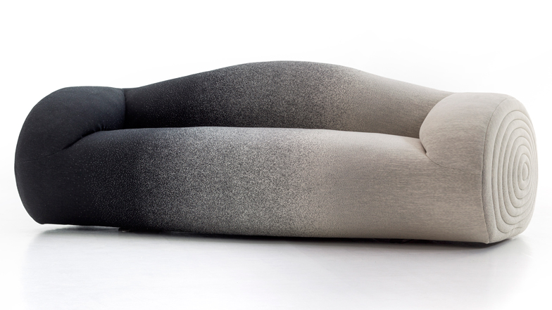
"The idea came about by accident, after seeing mattresses dumped in the street when walking in town, a sight which captured the boundless imagination of Ron Arad and triggered an imaginary operation of salvage and decontextualisation,"-Moroso
This design of a sofa blurs the boundaries between a mattress and a sofa- it makes one think of what could be done with mattresses at the end of their lives, how they could be reused. It is this kind of thinking that I want to incorporate into my own designs- to question the norms and blur boundaries, and to create designs that inspire thought. I also want to get inspired by my surroundings, just like how Ron Arad was inspired to make this design. To do so, I need to notice my surroundings more, which I will train my mind to do.
SOU FUJIMOTO
"For the Serpentine Pavilion 2013, I have created a translucent architecture, a terrain that encourages people to explore the site in new and diverse ways. ... The inspiration for the design of the Pavilion was the concept that geometry and constructed forms could meld with the natural and the human. The fine, fragile grid creates a strong structural system that can expand to become a large cloud-like shape, combining strict order with softness. A simple cube, sized to the human body, is repeated to build a form that exists between the organic and the abstract, to create an ambiguous, soft-edged structure that will blur the boundaries between interior and exterior... The topography of the grid is a flexible, multi-purpose social space, where the walls, seating and roof are made of the same steel cubes. In this way, the organic structure of the Pavilion overall creates an adaptable terrain, encouraging visitors to create their own experience of the building.
Whether attending an event or simply relaxing in the Park, each person is invited to find a singular, favourite space inside and around the Pavilion. By day, it will function as a space open to all visitors, with a café. The largest of the terraced areas can be used as an events space, while other terraces provide further spaces for visitors to inhabit and explore. From certain vantage points, the fragile cloud of the Pavilion appears to merge with the classical structure of the Serpentine Gallery, its visitors suspended in the space between architecture and nature."
-SOU FUJIMOTO
I want to draw from this piece and create designs with my own ideology. I am yet to develop one, but I want to create pieces with meaning behind them.
ISSEY MIYAKE
Issey Miyake's work draws me in because of its integration of function with form and creating beauty out of it. The aesthetic beauty of the products aren't added on as an afterthought, but rather, brought out through the form of the product. This is clearly seen in the Bao Bao Bag, whose fluid structure isn't embellished with extra furnishing, but rather, brought out through emphasizing on the form. The reflective nature of the outer cover adds to the flashy nature of the bag, embellishing it just the right amount. I want to draw from Miyake's Designs and incorporate this philosophy into my design: Less is More. When exploring function, I develop it integrated with aesthetics rather than treating them as separate subjects. I also want to, like Miyake, incorporate technology into my work, and keep up to date with the latest new materials and processes that could complement my designs and prove to be significant in my work.
MARIO TRIMARCHI
This tealight holder is a brilliant piece- it distorts the tealight using the mirrors placed at different angles, creating a new way of experiencing a tealight. This makes me think about the different ways we could experience our reality. In fact, everything we take for granted- tables, TVs, chairs, dustbins, language, could have evolved in a very different way from how it is now. It is interesting to think of how 'normal' came to be. I want to keep this thought in further projects of mine, and explore it further by turning rules and pushing boundaries and norms.
FOSCARINI
"Chaos and geometric shapes, the Big Bang suspension lamp is a model that will not go unnoticed: an explosion of criss-crossing forms which create an architecture of surfaces, lights and shadows, with a strong architectural and scenic effect. Playing the starring role in any setting, in the L and XL variants, it is ideal for more significant settings as well."
The Big Bang by Foscarini is a huge inspiration to me: the concept of the light is almost exactly the same as that for my illuminate project. I want to explore the technique of slotting further and see where it takes me.
SOURCES:
- http://www.ronarad.co.uk/home/
- https://www.dezeen.com/2015/04/15/ron-arad-moroso-glider-matrizia-sofa-milan-2015/
- https://www.archdaily.com/384289/serpentine-pavilion-sou-fujimoto
- https://www.theguardian.com/fashion/2016/apr/10/issey-miyake-45-years-at-the-forefront-of-fashion
- https://www.alessi.com/gb_en/designers/from-t-to-z/mario-trimarchi/tealight-holder-la-stanza-dello-scirocco-mt05.html
- http://mariotrimarchi.eu/
- https://www.foscarini.com/en/products/sos-big-bang/
EXTENSION PROJECT: BIBLIOGRAPHY
RESEARCH BRIEF:
SUSTAINABLE MATERIALS:
- https://www.theguardian.com/environment/2019/apr/03/scientists-invent-transparent-wood-in-search-for-eco-friendly-building-material
- https://science.howstuffworks.com/environmental/green-tech/sustainable/5-plastic-substitutes.htm
- https://c-r-l.com/content-hub/article/sustainable-construction-materials/
- https://www.holeandcorner.com/news/five-sustainable-materials-to-watch-for-2018
- https://simplicable.com/new/sustainable-materials
- https://www.industr.com/en/sustainable-manufacturing-principles-applications-and-directions-2333598
IDEAS AND INSPIRATION
- https://www.archdaily.com/893555/tensegrity-structures-what-they-are-and-what-they-can-be
- https://ifdm.design/2019/01/29/design-mixture/?lang=en
- http://archinew.altervista.org/2018/10/12/five-materials-that-could-help-us-design-a-more-sustainable-future/
- https://www.vetropack.com/en/glass-packaging/lightweight-glass/
- https://www.gopeople.com.au/blog/examples-eco-friendly-packaging-designs/
PRACTICIONERS
RON ARAD
- https://www.dezeen.com/2018/04/25/nude-ron-arad-nesting-vases-concentrics-glass-milan-design-week/
- https://www.phillips.com/detail/ron-arad/NY050113/86
- http://www.friedmanbenda.com/exhibitions/past/ron-arad-fishes-and-crows-1985-1994
SOU FUJIMOTO
- https://www.dezeen.com/2014/10/22/sou-fujimoto-many-small-cubes-installation-paris-jardins-des-tuileries-fiac-art-fair/
- https://www.artsy.net/artwork/sou-fujimoto-architects-inside-outside-tree
- https://www.lifestyleasia.com/kl/living/people/designer-spotlight-sou-fujimoto-on-the-constant-need-for-invention-in-architecture/
ISSEY MIYAKE
- http://mds.isseymiyake.com/mds/en/product/
- https://www.busyboo.com/2015/10/19/distortion-bag-baobao/
MARIO TRIMARCHI
- http://mariotrimarchi.eu/la-stanza-dello-scirocco/
- https://thetreemag.com/en/portfolio/out-of-scale-by-mario-trimarchi/
FOSCARINI